

A logo is often the first impression people get of a brand. It quietly communicates personality, tone, and what a website is all about before a single word is read. As Nouzie continues to grow as a place for thoughtful seasonal content, lifestyle reflections, and simple everyday inspiration, it’s a good time to explore what a refreshed logo might look like.
Below are five possible logo directions for Nouzie. Each one reflects a slightly different personality for the site — from cozy and welcoming to modern and minimal.
Take a look and let us know which one feels the most like Nouzie to you.
1. The Cozy Wordmark
Concept: Soft, rounded lettering that feels warm and friendly.
Design Details
- Lowercase handwritten-style font: nouzie
- Soft earthy color palette (sage green, warm beige, muted clay)
- Small leaf or spark accent above the “i”
- Slightly imperfect lines to give a human, welcoming feel
Why it works
This version emphasizes the relaxed and comforting tone of Nouzie posts. It feels like a warm cup of tea and a quiet moment.
Example layout idea:
nouzie
simple living • seasonal inspiration
2. The Modern Minimal Logo
Concept: Clean and modern with a strong digital feel.
Design Details
- Sans-serif font in lowercase
- Black or charcoal lettering
- Simple circular icon containing the letter N
- Works well as both a website logo and social media icon
Example concept:
(N) nouzie
Why it works
This design is sleek, simple, and easy to recognize across platforms.
3. The Seasonal Badge
Concept: A badge-style logo representing the changing seasons.
Design Details
- Circular badge
- Word NOUZIE across the middle
- Four small icons around the circle:
- leaf
- snowflake
- sun
- flower
Example concept:
   ❄
🌿 NOUZIE ☀
   🌸
Why it works
Nouzie often focuses on seasonal transitions and everyday life rhythms. This logo highlights that theme directly.
4. The Friendly Script Logo
Concept: A handwritten signature-style logo.
Design Details
- Flowing script font
- Slight underline flourish
- Soft pastel palette (dusty blue, blush, cream)
- Could include a small house or heart icon
Example concept:
Nouzie
───────
Why it works
It feels personal, almost like a note from a friend. Perfect for a lifestyle blog voice.
5. The Spark Logo
Concept: A clean wordmark with a small “spark of inspiration.”
Design Details
- Modern serif font
- Gold or warm yellow sparkle above the i
- White background with strong contrast lettering
Example concept:
nouzie ✦
Why it works
It represents the idea that Nouzie provides small sparks of inspiration for everyday life.
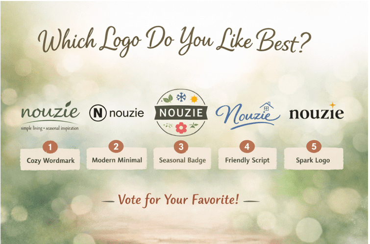
Which Logo Do You Like Best?
If Nouzie were to refresh its logo, we’d love to know what readers think.
Which design do you prefer?
1️⃣ Cozy Wordmark
2️⃣ Modern Minimal
3️⃣ Seasonal Badge
4️⃣ Friendly Script
5️⃣ Spark Logo
Or maybe you like elements from more than one.
Your feedback helps shape the future look of Nouzie!
