


When I was a little girl, I remember loving to colour. At Christmas, my parents would let us open one early gift; every year, it was colouring books and Crayola crayons. We would be busy colouring for hours—well, at least I was. At eight, I discovered the magic of painting. It was my first paint-by-numbers, and I was overwhelmed by how much I adored it.
By my teenage years, I had a summer job in the pediatric wards at the regional hospital where I painted uplifting scenes on the walls. Even though I chose to pursue a teaching career in Special Education, after a while I sought to perfect my art knowledge by studying plastic arts for a year. After, I devoted time in my schedule teaching art classes to students and giving ateliers to teachers.
Since my retirement, I have been actively working to build up my painting career. In my painting journey, I went from exploring chiaroscuro (clair-obscur), a classical technique, to using vibrant pigments, discovering that I could better express myself with colours.

I first heard of chiaroscuro years ago during an art history class. The dramatic light effect stayed with me. Chiaroscuro is an artistic technique using high contrast between light and dark to create the illusion of volume by gradation of values. The origin of the technique is traced back to ancient Greece. It was abandoned in the middle ages, picked back up again in the renaissance, and then renounced by impressionism.
Coming back to painting after many years, I discovered the book, An Artist Teaches by David Leffel, an American artist that uses the technique in his paintings. In summary, he mentions that in chiaroscuro the shadows are warm while the light is cold. “It is in the laying of the lights of the painting that the oft-repeated phrase, ‘warm colours advance, cool colours recede’ is pronounced. It is completely reversed in the darks.”
It was the opposite of everything I learned about painting; it was an eye opening experience for me.
After a few years exploring Chiaroscuro, eager to improve my painting skill and seeking how to better express my voice, I started taking advanced painting workshops with a wonderful artist and teacher, Maggie Rose. During that time, I discovered colours come more naturally for me. Everything seems more accessible with colour.
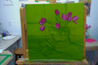
I use my sense of colour to create, hoping people can feel my paintings. What interests me the most are the subtle changes I can make in either direction: the light side or the shadow side. The forms start off simplified, but then I modify each value in three to four different tones using colour saturation to get the effect of push and pull. Applying colours then becomes fascinating; I like to feel the way they interact with each other.
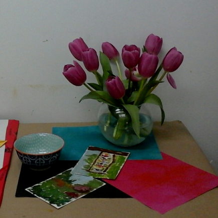
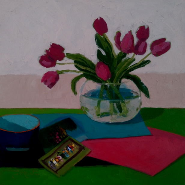
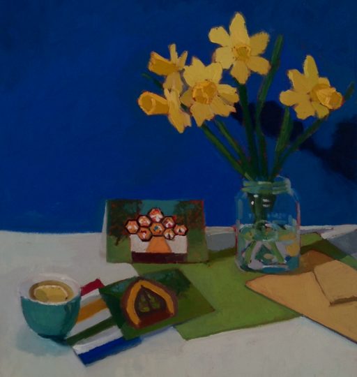
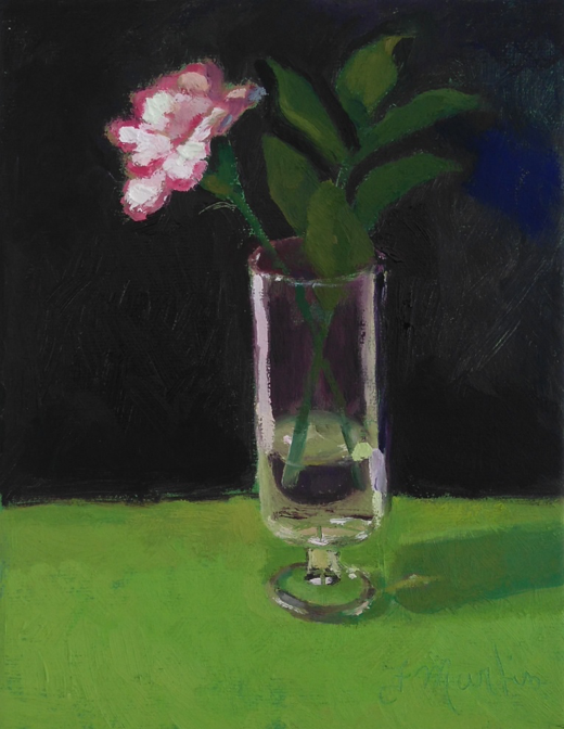
My paintings are predominantly still life paintings, brought into existence from the tranquility of my small studio. The subjects are familiar objects, often picked up spontaneously, and represent moments of everyday pleasure.
Before entering my studio, I often have a feeling of nervousness and uncertainty. I love colours and take time mixing them. As soon as the first stroke of paint is applied to the canvas, I am in peace.
Recently, I have been working with colored paper. I like to surround objects with different colours to see how they relate with each other, and then, I make some little colour studies to find the right vibration. I think that they could become good abstract paintings. Perhaps, in the future, my paintings will move in that direction.

Above all, painting for me is a question of sensitivity. I am not trying to describe exactly what I am seeing, but rather feel the vibration of the colours within the painting. When you find yourself in front of a painting, what speaks to you the most: the beauty of the form or the sensation of the colours? I mostly respond to colour.
This story was brought to NouZie by RSS. The original post can be found on https://www.createdhere.ca/stories/2021/9/9/sl1j07an9gmki4ioi4teg2oavqmf4z
