

Most people want to save energy and reduce emissions. But it’s hard to know where to start – and where to get the biggest bang for your buck. As a result, many of us get stalled in a zone of uncertainty or ‘analysis paralysis’.
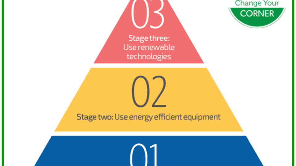
Here’s a graphic that should help: the Energy Efficiency Pyramid. It’s pretty straightforward, with three simple stages that should be done roughly in order:

Stage One is about habits, Stage Two is about upgrades and efficient equipment and Stage Three is about where your energy comes from.
Here are a few examples to help clarify:

And why try to do them in order?
- Stage One actions can result in significant savings at virtually zero cost. They’re also the easiest to take – simply behavioural changes.
- Stage Two actions can also result in very significant savings, but you do need to spend some money to achieve those savings.
- Stage Three actions complete the savings and sustainability process, but they’re usually also the more expensive actions to take. That’s why it’s usually best to do all you can on Stages One and Two first, and only then look to Stage Three. For example, we have a solar power system here at home – but we only had it installed after we reduced our power consumption as much as possible by adopting energy-saving habits; making efficiency upgrades; and installing efficient lighting, appliances and heating equipment.
So use the Energy Efficiency Pyramid to help you save energy and reduce your costs as efficiently as possible! (Perhaps worth printing off and posting on your fridge, and discussing over supper…)
This story was brought to Nouzie by RSS. The original post can be found on https://carlsgreenideas.wordpress.com/2026/01/08/a-clear-graphic-to-guide-you-to-savings/
